
Bar Chart
Pronunciation: /bɑɹ tʃɑɹt/ Explain
|
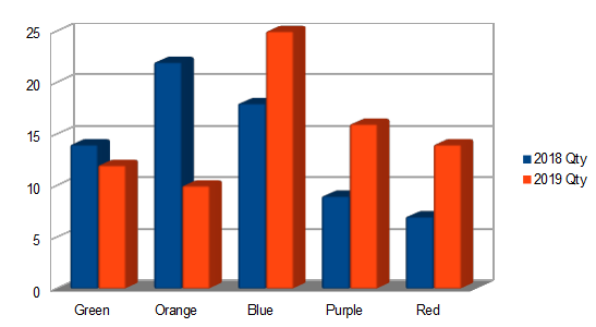
A bar chart is a graph where rectangles represent quantities. The bigger the rectangle, the larger the quantity. The rectangles can be vertical or horizontal. A bar chart is also called a bar graph. |
How to make a bar chart using OpenOffice Calc
Click here to download OpenOffice.
| Step | Illustration | Instructions |
|---|---|---|
| 1 | 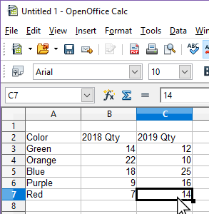 |
Type in the data. In the example, the data is colors and quantities. |
| 2 | 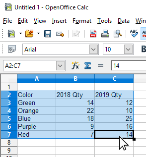 |
Click on the first cell with data or header information. Then, without unclicking drag to the last cell of data. This selects and highlights the data you want to make into a bar chart. |
| 3 | 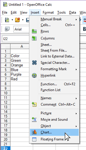 |
In the strip menu at the top, click on Insert, then on Chart. |
| 4 | 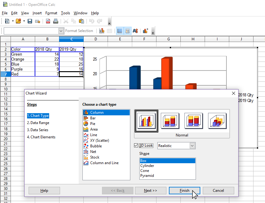 |
In the chart wizard, click on the Finish button at the lower right. |
| 5 | 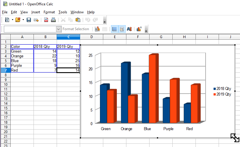 |
To resize the chart, click on one of the eight 'handles' around the chart and drag it. |
Try creating a chart, then changing the numbers to see what happens to the chart.
References
- McAdams, David E.. All Math Words Dictionary, bar chart. 2nd Classroom edition 20150108-4799968. pg 23. Life is a Story Problem LLC. January 8, 2015. Buy the book
Cite this article as:
McAdams, David E. Bar Chart. 1/25/2019. All Math Words Encyclopedia. Life is a Story Problem LLC. https://www.allmathwords.org/en/b/barchart.html.Image Credits
- All images and manipulatives are by David McAdams unless otherwise stated. All images by David McAdams are Copyright © Life is a Story Problem LLC and are licensed under a Creative Commons Attribution-ShareAlike 4.0 International License.
Revision History
1/18/2019: Initial version. (McAdams, David E.)- Navigation
- Home
- Contents
-
# A B C D E F G H I J K L M N O P Q R S T U V W X Y Z - Teacher Aids
- Classroom Demos
- How To
- LIASP
- LIASP Home
- Conditions of Use
- Privacy Policy
- Donate to LIASP
- Help build this site
- About LIASP
- Contact LIASP
All Math Words Encyclopedia is a service of
Life is a Story Problem LLC.
Copyright © 2018 Life is a Story Problem LLC. All rights reserved.
This work is licensed under a Creative Commons Attribution-ShareAlike 4.0 International License