
Pie Chart
Pronunciation: /paɪ tʃɑɹt/ Explain
|
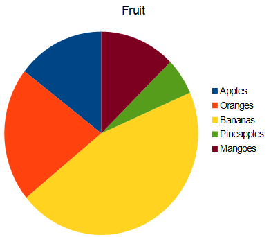
A pie chart is a graph that divides up a circle in the slices. The whole circle represents the entire set being graphed. Each slice represents a portion of the whole. A pie chart is also called a pie graph |
How to make a pie chart using OpenOffice Calc
Click here to download open office.
| Step | Illustration | Instructions |
|---|---|---|
| 1 | 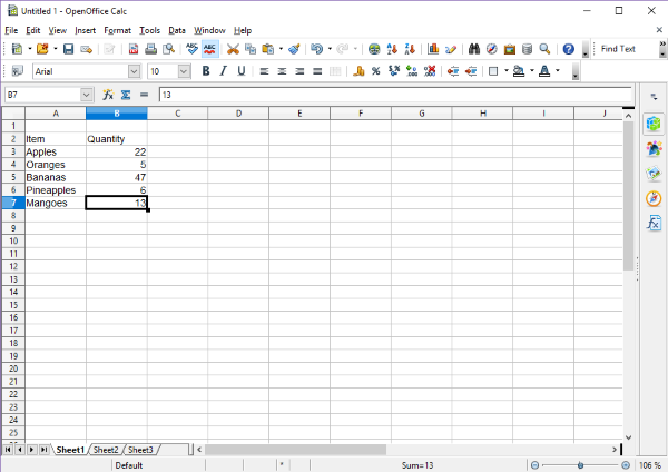 |
Type in the data. In the example, the data is types of fruit and quantity of fruit |
| 2 | 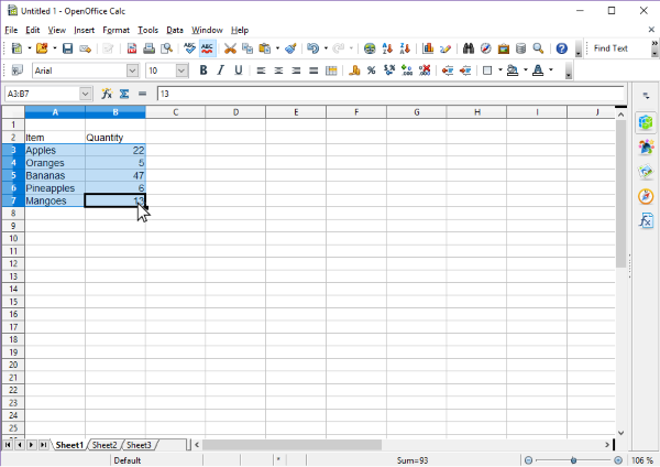 |
Click on the first cell with data, then without unclicking drag to the last cell of data. This selects and highlights the data you want to make into a pie chart. |
| 3 | 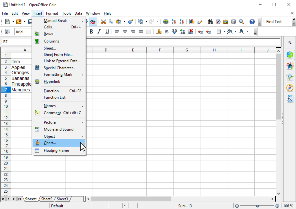 |
In the strip menu at the top, click on Insert, then on Chart. |
| 4 | |
In the chart wizard, under Choose a chart type, click on Pie. |
| 5 | 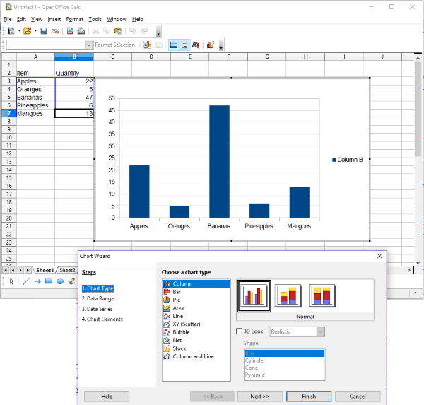 |
In the chart wizard, click on the Finish button at the lower right. |
| 6 | 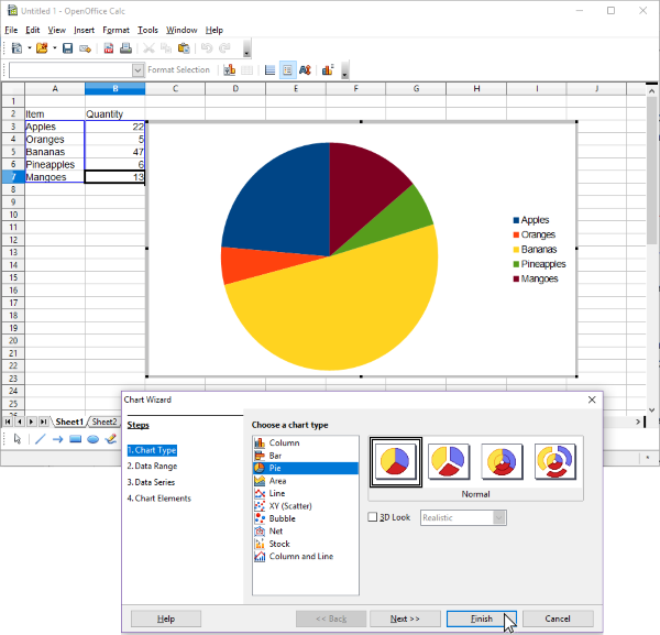 |
To resize the chart, click on one of the eight 'handles' around the chart and drag it. |
Try creating a chart, then changing the numbers to see what happens to the chart.
References
- McAdams, David E.. All Math Words Dictionary, pie chart. 2nd Classroom edition 20150108-4799968. pg 139. Life is a Story Problem LLC. January 8, 2015. Buy the book
Cite this article as:
McAdams, David E. Pie Chart. 1/18/2019. All Math Words Encyclopedia. Life is a Story Problem LLC. https://www.allmathwords.org/en/p/piechart.html.Image Credits
- All images and manipulatives are by David McAdams unless otherwise stated. All images by David McAdams are Copyright © Life is a Story Problem LLC and are licensed under a Creative Commons Attribution-ShareAlike 4.0 International License.
Revision History
1/18/2019: Initial version. (McAdams, David E.)- Navigation
- Home
- Contents
-
# A B C D E F G H I J K L M N O P Q R S T U V W X Y Z - Teacher Aids
- Classroom Demos
- How To
- LIASP
- LIASP Home
- Conditions of Use
- Privacy Policy
- Donate to LIASP
- Help build this site
- About LIASP
- Contact LIASP
All Math Words Encyclopedia is a service of
Life is a Story Problem LLC.
Copyright © 2018 Life is a Story Problem LLC. All rights reserved.
This work is licensed under a Creative Commons Attribution-ShareAlike 4.0 International License